The Number field is a single textbox that's validated to only accept numerical answers.
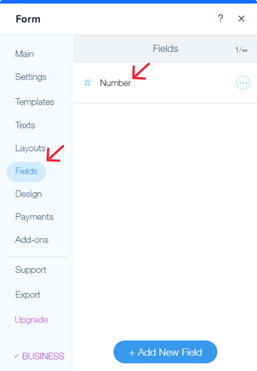
In the Fields section, click on the Number field to be able to edit the field.
Proceed with the following actions.
Set the label to be hidden or shown by switching the toggle button on/off correspondingly.
Please note
Even if the Label is hidden, the title of the field will still be visible in the notification emails.
In case you would like to receive the email without the label of the field, then simply delete it manually from the Field Label textbox in the Settings.
In case you would like to receive the email without the label of the field, then simply delete it manually from the Field Label textbox in the Settings.
Type in the Label of the field, the title you want your users to see.
Placeholder text:
Placeholder specifies a hint that describes the expected value of an input field. The text of the placeholder displayed in the field before you enter a value, and disappears when you begin typing. The text can be modified according to your needs, too.
Field size:
Adjust the size of the field based on your preference.
Range:
Set the number of characters that can be inputted in the Number field with the Min and Max range.
The filled data will only pass validation if the value entered is a number that falls within the designated range.
The filled data will only pass validation if the value entered is a number that falls within the designated range.
Number/ Character:
Under the Range section, you'll find the dropdown field with Number and Character option.
Number:
Stands for blocking a certain number/numbers with Min and Max range.
For example, if you set 1 for Min and 5 for Max, the field will require no other number than 1 or 5. Otherwise, the validation won't allow submitting the form.
For example, if you set 1 for Min and 5 for Max, the field will require no other number than 1 or 5. Otherwise, the validation won't allow submitting the form.

Character:
Character limits the quantity of characters that can be inputted in the field.
For instance: If the Max limit of required input is set 5, then the field should not be filled with more than 5 characters.
For instance: If the Max limit of required input is set 5, then the field should not be filled with more than 5 characters.

Instructions for users:
Add Instructions if you want to provide additional information regarding the field. You can use this option to specify the exact input type you require from them. All form fields that require user input have an instruction box where you can add some additional information.
The instructions will be displayed above the field.
The instructions will be displayed above the field.
Remember to activate the Required option, to signify that the field can not be left blank (a red asterisk * next to the field will indicate that it is required).
Was this article helpful?
That’s Great!
Thank you for your feedback
Sorry! We couldn't be helpful
Thank you for your feedback
Feedback sent
We appreciate your effort and will try to fix the article